Rebuilding Cafe Bazaar’s Component Architecture
Rebuilding Cafe Bazaar’s design system so design, engineering, and content operations could work from the same product model.

Translation note: All original project content was in Persian and has been translated into English for this case study.
Overview
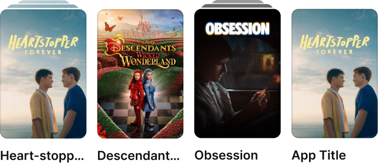
Cafe Bazaar’s old design system could describe a carousel of apps. It could not describe a carousel, or an app, on their own.
Items, arrangements, and complete sections all existed at the same level. Similar components were repeatedly created for different pages, while Figma, code, and the content panel represented them differently.
The design team initiated the project. I later became the system’s owner and continued as its sole designer, working with backend, Android, and frontend engineers while three peer product designers used the library.
We had components, but no shared system
The library had accumulated through years of feature work and changing teams. Components were often created for one context without considering how they related to the rest of the product.
The consequences appeared throughout the workflow:
- Figma and code did not consistently match.
- Designers could not reliably determine what already existed.
- Older components lacked Auto Layout and often had to be rebuilt before they could be used.
- Engineers lacked a dependable design reference.
- Product teams repeatedly recreated similar patterns.
- Content operators faced unclear choices and technical problems in their panel.
I rebuilt the system at five levels.
Rebuilding the system at five levels
1. One model for composition
An audit across the product, Figma, and code revealed a flat structure where items, arrangements, and complete sections sat at the same level.
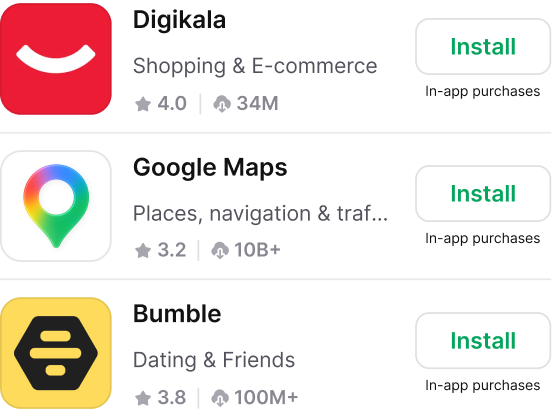
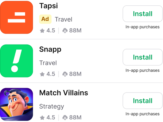
I introduced a page–section–arrangement–item model and validated it with backend, Android, and frontend engineers. Items could now appear independently in carousels, lists, or standalone content. The backend composes surfaces from these definitions at runtime, while Figma, Android, web, and the content panel use the same model.
2. Purpose before variation
A component backlog helped me evaluate each pattern’s purpose, users, controls, reuse, and cost before consolidating, redesigning, or preserving it.
Working with product, engineering, and content stakeholders, I reduced roughly 60 inherited components across Discovery and other core product areas to 18 shared components. Including foundational and reusable UI components, the complete library reached 40+.
Components without a clear purpose were redefined. Editorial, for example, had shipped without design involvement and was defined mainly by motion. I redesigned it as a curated editorial surface. Its effect still needs post-launch validation.
Content-panel controls followed the same reasoning. Operators never open Figma, but their settings determine what customers see. The rebuilt panel defined what they could edit, what remained fixed, and which combinations it prevented. We defined these rules through a series of working sessions with the backend engineer.
3. Rules inside each component
Each component specified which shared atoms, variants, and component-specific building blocks it accepted. Content Item, for example, supported only compatible media cover sizes, metadata, tags, and actions, keeping Figma and code flexible without allowing broken layouts.
Finding the right level of reuse was a challenge. I initially designed separate items for Search, Discovery, Video, and Mini-games. After reviewing their shared logic with backend engineers, I consolidated them into one Content Item.
4. Shared craft standards
During foundations, I owned typography and iconography. I later rebuilt components with six token groups—typography, colour, layout, spacing, radius, and elevation—and standardized states, light and dark modes, RTL, accessibility, and selected motion. Auto Layout made responsive behaviour easier to handle.
Components with coloured backgrounds or gradients also needed rules for colour selection, light and dark options, and text and icon colours—without creating unnecessary work for operators.
I proposed automating this styling, but its engineering requirements and unresolved edge cases exceeded the project’s scope. We postponed it and retained controlled manual options.
5. Preparing the system for developers’ AI-assisted workflow
I defined a repeatable handoff covering each component’s purpose, data, states, interactions, properties, and restrictions. AI helped draft the specifications and prepare them for developers’ AI-assisted tools.
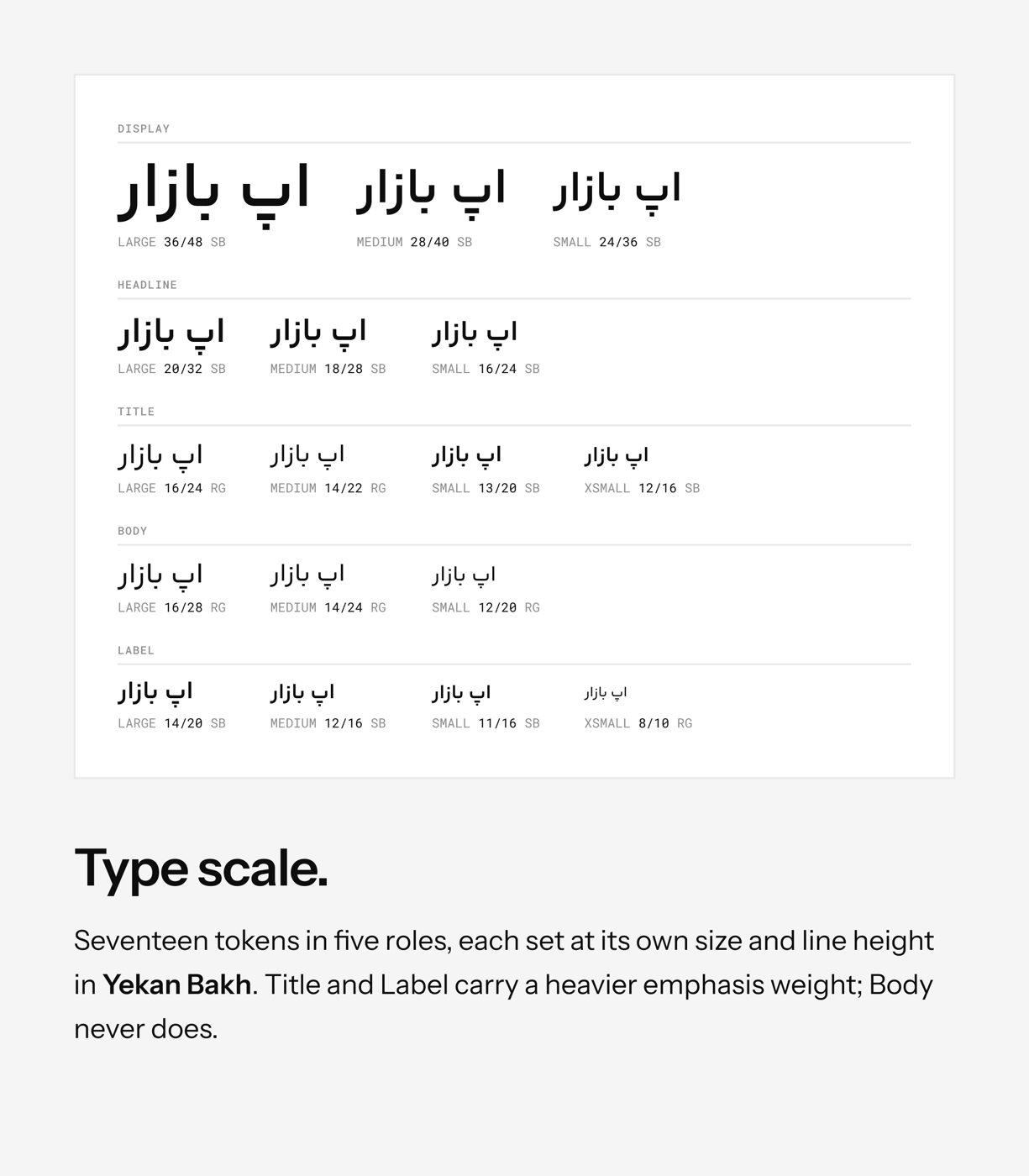
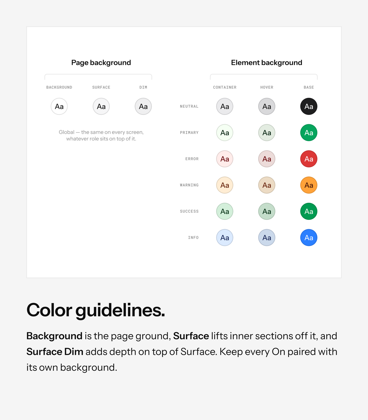
Figma, specifications, and implementation used the same vocabulary. A frontend developer used this structure to implement the components in eight working days. Without a baseline, this remains an implementation milestone rather than evidence of faster delivery.
Want a closer look?
















Where it stands
Where the old system treated compositions as separate components, the new system gives Figma, runtime composition, Android, web, and content operations one shared model.
The system now includes:
- 40+ components published in Figma and available in Storybook and product code
- 6 token groups covering typography, colour, layout, spacing, radius, and elevation
- RTL and accessibility support
- Android and responsive web coverage
- 5+ migrated product flows, with implementation coverage varying by flow
- A published Figma library used by three product teams
- A content panel rebuilt around the shared hierarchy
- A component-request and issue-reporting process published in the design-system channel
All components are coded, but the system is awaiting production rollout.
After rollout, the next step is to validate adoption, the redesigned component roles, and whether styling automation is worth further investment.
Reflection
The project changed how I collaborate with engineers. I learned to involve developers while component decisions are still being made, rather than waiting until the design is complete. Designing a component now means considering its purpose, contract, operational cost, and place in the larger product system—not only how it looks.